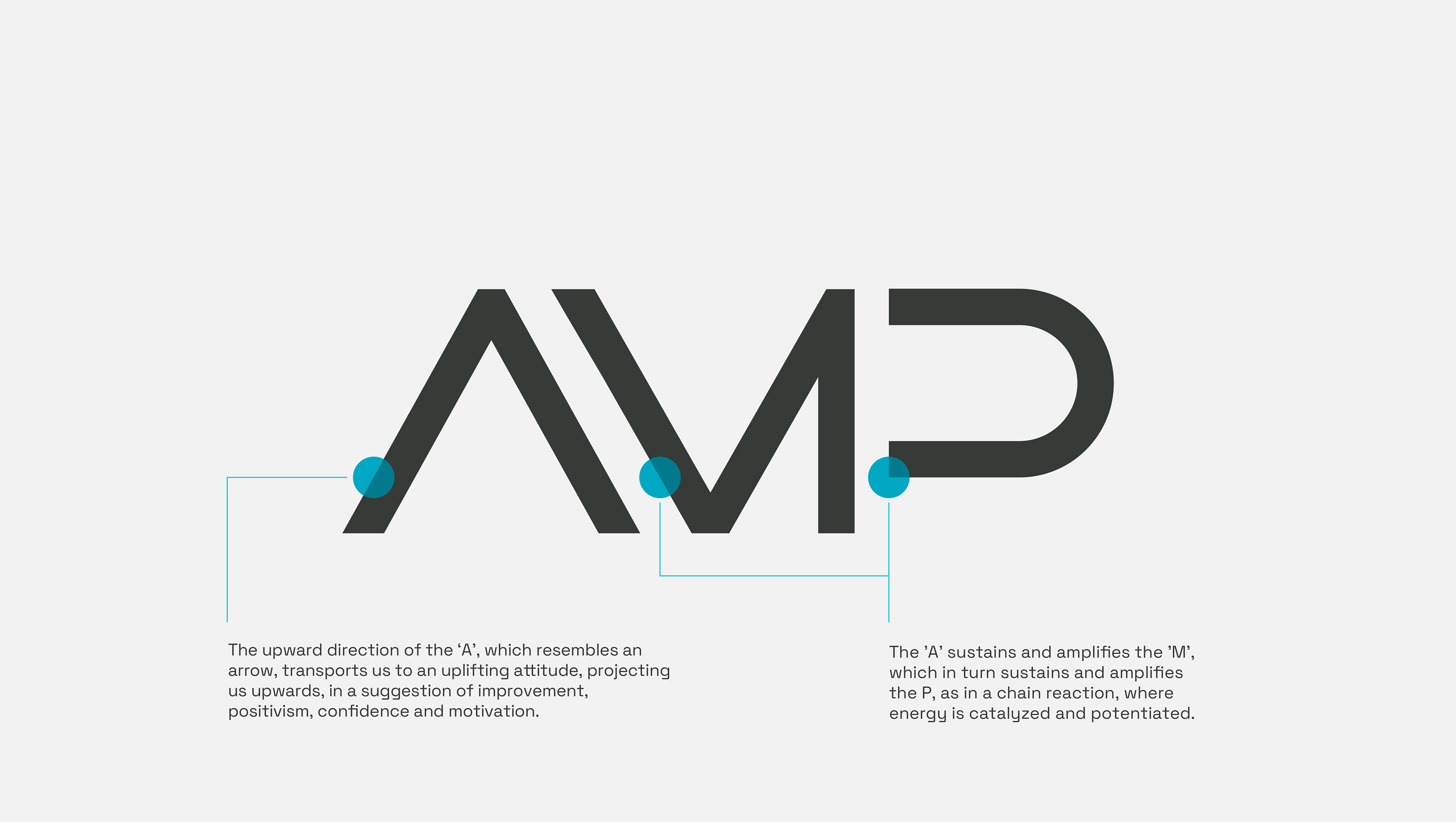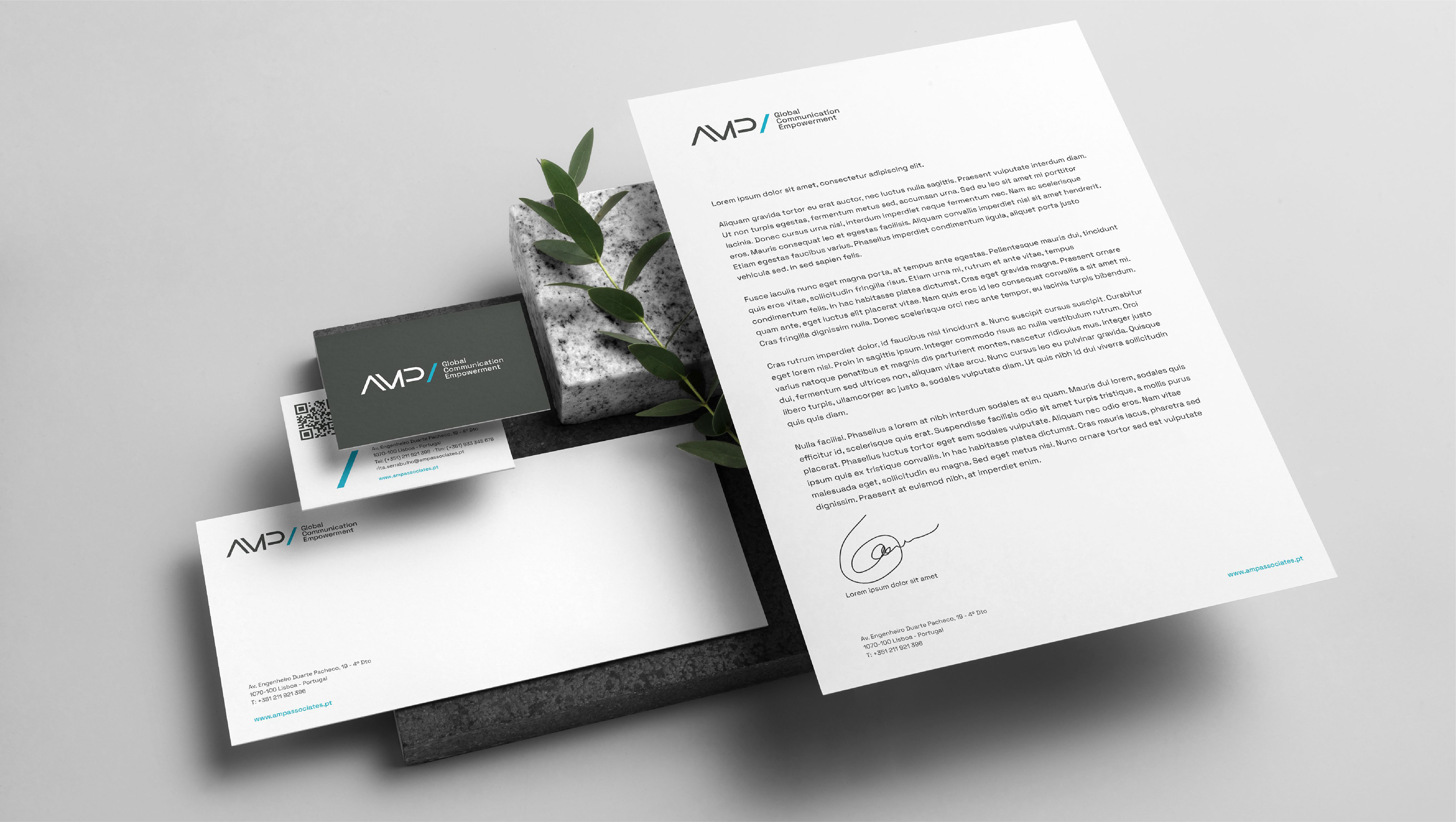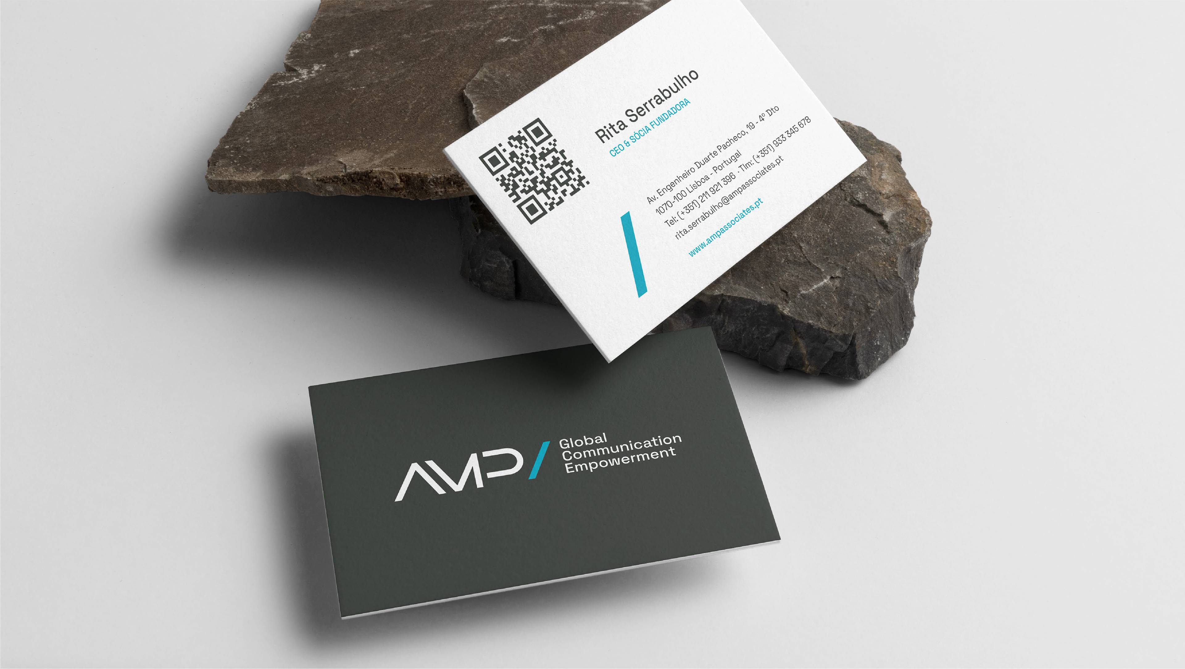
In essence, the action generated by AMP often resides in establishing a connection between its customers and the public. This link translates into identity through the letter 'A' that supports the 'M' which in turn expands the 'P' as in a chain reaction that forms the acronym AMP.
These letters are drawn from the blue bar and make the 'A' of AMP an upward arrow, giving us a suggestion of evolution, confidence, positivism and motivation.
These letters are drawn from the blue bar and make the 'A' of AMP an upward arrow, giving us a suggestion of evolution, confidence, positivism and motivation.
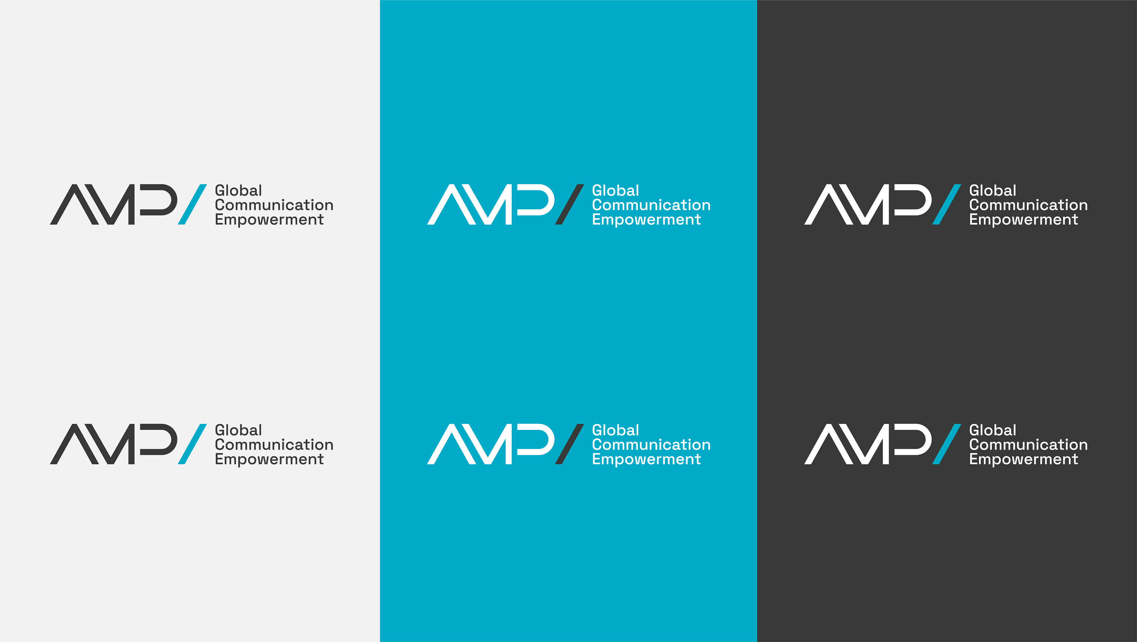
The AMP blue colors in contrast to a monochromatic background in dark gray tones give a modern and sober institutional tone, typical of this business area.